Blue is Better Than Green
by Daniel Menjívar • #blogging
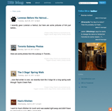
Yes, I recently updated the design of my blog and made some minor changes here and there. Not big ones, but small details that seem to make a world of difference. The most noticeable difference is that I changed the background (and accent) color from green to blue. And I much prefer the blue…
Six months ago, I had blogged about consolidating my many websites and my reasoning behind dmred.ca but this weekend I took that consolidation a step further and got rid of dmred.ca altogether.

Apart from the fact that I had everything linked on one site, my favourite thing about dmred.ca was the blue background. When I re-designed my blog earlier this year, I modeled it after dmred.ca but went with a green background just to make it different. But I much preferred the blue all along.
The biggest problem with dmred.ca was that every page basically encouraged you to leave the site and visit another site instead (usually DanielMenjivar.com or DM Blog). And though promoting those two sites was my main intention all along, it didn’t make sense to have a website that encouraged you to do nothing else but leave. I was still able to find a way to keep all that content though – it just has a new home on either DanielMenjivar.com or on my blog.
it’s much easier to regularly update just two websites and not three (or more) and I think it will be a more effective use of my time if I channel all my efforts into two major sites instead of spreading it thin across multiple satellites, most of which are redundant most of the time anyways. The content on dmred.ca’s homepage is now essentially the same as my blog’s homepage; the photos page on dmred.ca just directed you to the photos tag on my blog anyways; my list of domain names for sale is now on my blog; and the contact page was exactly the same thing as the contact page on DanielMenjivar.com. The only page I didn’t move yet is my resume, but that’s eventually going to live on DanielMenjivar.com – I’m going to be making some other changes to DanielMenjivar.com in the near future so I’ll incorporate it at the same time. (The back-end of my resume is much more complex than what users see; with an automated resume emailer, email tracking, custom reports, etc.)

For some reason, I really like the way my blog looks with the blue background now. While I also made some other minor changes here and there, (like an image to link to DanielMenjivar.com in the sidebar instead of just text links), I really think the biggest impact came from just changing the background color.
Here’s a list of the changes I made:
- changed the background and accent colors from green to blue
- made the background gradient "fixed" on the page rather than adjusting to the page height on each page (but still only CSS)
- moved the sidebar to the left side instead of the right
- moved the search bar into the sidebar instead of on top
- cleaned up the twitter updates with new icons
- added an image to link to DanielMenjivar.com instead of just a text link
- added a domains page (moved from dmred.ca)
- made fonts smaller on every page (looks much better), except for on single blog pages (to keep articles super easy to read)
It was just a small amount of time with just one CSS file to make it all happen, but there’s something about the blue that I really like. Who would have thought that just one small change like that could make such a big difference? Blue is better than green – don’t you agree?