DM Blog 2013
by Daniel Menjívar • #bloggingI started working on some updates to my blog back in and though my original goal was to get the new site/design up on (the fifth anniversary of my blog) I wasn’t able to get it up until , one week late…
I’ve been working on this for a while now. Glad to finally have it up… DM Blog Check it out #wordpress
— Daniel Menjívar (@DanielMenjivar) December 12, 2012
I’ve changed my blog’s design several times over the years, (and blogged about it now and then) but I hadn’t noticed, until I was getting some screenshots ready for this article, that it’s always been in December/January every year… (Except in 2011 – I changed things three times that year!)
Here are some screenshots of the homepage over the years:
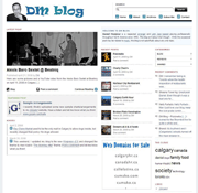
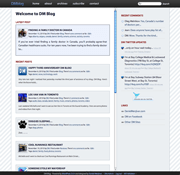
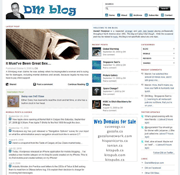
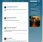
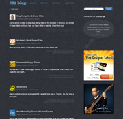
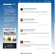
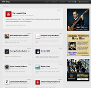
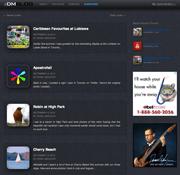
I’ve been using my own custom WordPress plugin and theme for several years now, but this time I decided to rewrite everything from the ground up. Apart from my usual goal of making things faster and more efficient while doing things "the right way", I also had a ton of new features/changes I wanted to do this time around. So while the main structure of the design hasn’t really changed much over the years, it’s the stuff happening in the background (the things most people don’t really see) that I’m most excited about.
WordPress has gained a lot of popularity over the years, perhaps mostly because it’s extremely easy to use, but the code is a real mess and big pain in the butt to customize, unfortunately. And it’s also notoriously slow, but usually because people add a ton of plugins – the more you add, the slower things get. that’s why I decided a long time ago to just code everything myself and not rely on third party plugins, and the results are obvious. (Most pages on my blog load in less than 0.15 seconds, compared to about 3 seconds for the average WordPress blog.)
But before I get into anything too technical on the plugin side of things, here are a couple of front-facing features that I added:
DineSafe
In addition to Zomato links, my restaurant reviews in Toronto now have links to DineSafe inspection results. And rather than just linking to the information, the inspection results display right on the page and it’s all updated in real time! I haven’t added this to all my old reviews yet, but you can see my review of Pearl Harbourfront to see an example.
Retweet This
A while back I created a Twitter account for my blog and I’ve been tweeting every time I write something new. But it occurred to me that I should have an easier way for visitors on my blog to discover that account, while also providing a way for them to retweet my articles to their followers. Being the "type A" kind of guy that I am, I’m in the process of going through all my old articles (making tiny edits here and there where necessary) and tweeting a link to each one, in order… So if you look at some of my older articles from 2008 you’ll see a "retweet this" link at the top of every article…
HTML5 Audio & Video
I’ve been using HTML5 Audio & Video on my blog since about mid-2010, but all the older videos and audio samples were still in .mp3 and .mov format. Not anymore. All audio & videos are now HTML5-compliant and in some cases, a little larger now too (from 480px wide to 640px wide). All new videos will be 720p though, and have been for some time.
Retina Ready
All graphics and icons on the site are retina-quality images, except for photos since that would significantly increase the loading time for each page. At the same time though, I’ll be including much larger versions of my photos going forward. Previously, when you clicked on an image thumbnail in my articles, it would load an image 640px wide, which I later increased to 720px, but now I’ll be including photos that are 1080px wide. Larger photos, more detail…
Custom iPhone Icons
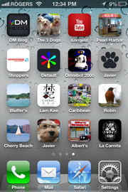
I’ve had a custom iPhone icon for my blog (and for DanielMenjivar.com) for years, but now all articles will have their own individual icons too. Bookmark an article and save it to the home screen on your iOS device (like an iPad or an iPhone) to see it in action. The homepage has its own icon, and every article falls back to a default icon if I’ve been too lazy to create one for that article, but it really isn’t that much work… it’s just a single 256x256 image that I use for every article and I use it everywhere on the site, Twitter uses it when embedding summaries of my articles into tweets, it’s the same image for the iPhone icons, and I also use it in my email updates to subscribers. One image, many uses.
Email Subscriptions
Speaking of email updates to subscribers, I previously had FeedBurner taking care of this for me, but I hated how every article showed the time in Pacific Time (PST) instead of my timezone, and I didn’t have much flexibility in how the summaries were being displayed. Plus, once Google bought FeedBurner, I wasn’t comfortable not having complete control over this. I know WordPress has a JetPack plugin that handles this (in addition to a slew of other things), but apart from not wanting to slow things down by adding another plugin, I also hated that it adds a Quantcast script to track users and gather data, for who knows what (undisclosed) purpose. No thanks. So I created my own email subscription system for WordPress, which is more involved than maybe most people realize. I had to add a way for people to add their email address, verify the email addresses, cancel at any time, as well as the obvious sending out an update to subscribers. it’s up and running (and works well) but I still plan on tweaking the look of the emails that get sent out, eventually… In the meantime, add yourself using the subscribe link in the header!
Timezones
Speaking of "my timezone", you may notice that this article shows "EST" at the top along with the article time. WordPress is terrible at handling timezones correctly so I had to work a little harder to "fix" this and get it to work right. Now each article can have its own timezone (some of my older articles have a MST timezone from when I was in Calgary) and if I happen to move out west again (unlikely) or change my server’s timezone, it won’t throw everything out of whack…
Geodata
One of the coolest features I added this time around, (at least I think so) is the ability to geotag each article. More than that though, I also added a map to the archives page so you can see all my articles on a map. I’m still in the process of geotagging all my previous articles, but for now, if you zoom in on Calgary, you can see a lot more articles… I think it’s really neat to see articles on a map and to be able to find other articles that might be geographically similar. I’ll be blogging about this a lot more in the near future but for now, click on "Toronto, Ontario" at the top of this article and watch how the map moves and zooms you into Toronto. Cool!
Best Of…
Speaking of the archives page, I also added a "Best Of" (or a "featured article" section) to the top of that page. I’m still in the process of going through all my old articles and selecting the "best" ones to feature there so it’s a work in progress, but at least I have the ability to easily add/remove articles from that section at any time now. Are there any previous articles that pop into your head that you think should be there?
Safari Previews

One of the funner things I did (and perhaps more trivial than a feature per se) was to create a custom preview for the Top Sites page on Safari. I’ve always liked how iCloud.com shows a giant iCloud icon rather than a preview of the page, so I tried doing something similar for my blog. Neat.
Ajax Comments
In my quest for increased speed and efficiency, I started out by adding "Last-Modified" headers to every page and creating a custom caching system (backend) to speed up the loading of every page. If you can believe it, things were loading way faster than even now, but one of the things I initially forgot to account for was comments. In the end, I realized there were too many variables at play with the comments so I had to get rid of the caching (for now) until I could address this properly down the road. (And I’m not sure that I ever will – too much time spent for too little gain.) But I did, however, change it so that comments are loaded (by Ajax) only when that part of the page becomes visible. Pages are much smaller now and load faster, and only when a user scrolls down and reads the whole article do the comments load.
I’m also loading (gr)avatars via ajax as a user fills out the comment form (similar to how the jetpack plugin does), and comments are submitted using ajax instead of requiring a full page load like before. As a side benefit, it has also significantly reduced the amount of comment spam I get now, which I’ll also be blogging about in a future article.
WordPress Plugin Modules
In the early stages of re-writing my plugin, (before I started to add any new modifications/features), I was trying to find the best way to organize my code. Normally each WordPress plugin takes care of just one feature, but I didn’t want to have a ton of plugins, just one. It was an important thing to figure out early-on since I only wanted to use ONE plugin (to manage my subscription system, add caching, add geodata functions, shortcodes, admin stuff, etc.) and without creating a huge mess… In the end, I ended up creating somewhat of a "module" system for my plugin, based on a base PHP class I created. Now, to add a new feature to my blog I just need to drop a single PHP file (that extends my abstract PHP class) into a folder, and that’s it. And to remove the feature, I just remove it from the folder. it’s pretty neat, very organized and super handy, so of course, I’ll blog about this in the future too.
Anyways, lots of new stuff this time around. I’ll be sure to blog about them more in depth in the future. Actually, I have about 25 topics on my list of future articles right now – I’m just having a hard time getting to them all. Lots of photos coming in the near future too!