Show or Hide a Sidebar on iPad Based on Orientation
by Daniel Menjívar • #codeIf you look at this site on an iPad, a sidebar is visible on the right-hand side of the page only when the iPad is in a landscape orientation. The sidebar disappears when the iPad is in a portrait orientation, but everything else stays the same. I’m not using any JavaScript to do this, only CSS media queries.
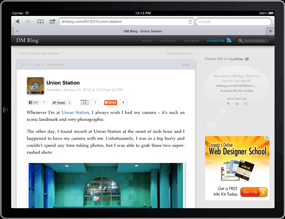
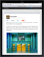
Actually, when this site is viewed in any type of browser (desktop, iPad, etc.) the sidebar disappears whenever the width of the browser is less than 1024 pixels. If you’re using a desktop browser, (on a screen wider than 1024 pixels), try resizing your browser window (both wide and narrow) to see the difference…
There’s actually two parts to making this work on the iPad – CSS media queries and the HTML viewport meta tag. First, Here’s a simplified/condensed version of the CSS:
/* for all media types */
@media all {
	#side { /* a bunch of css stuff here */ }
}

/* for narrow screens only */
@media only screen and (max-width: 1023px) {
	#content, #nav-bar { width: 696px; }
	#side { display: none; }
	.mobile #side { display: block; }
}

/* for print media types only */
@media print {
	#side { display: none; }
}
Pretty simple. First a bunch of CSS that’s applied to everything, then fixes/changes for smaller screens, followed by fixes/changes for mobile devices. (I included the print section only as a reminder that you should always create print styles for your content.)
On this site, (powered by WordPress), my custom plugin adds a mobile class to the <body> tag if it’s viewed on a mobile device. You might want to include the iPad as a mobile device, or not, it all depends on what you’re trying to do. In my case, I’m not including the iPad as a mobile device because I only want to style things differently for smaller mobile devices – the iPad uses the desktop/default version of the site just fine. I could have also done this using only CSS media queries and just checked for even smaller screens, but I already had my plugin checking for mobile devices via PHP anyways (for other things too) so it was just as easy to use the mobile class in the stylesheet.
The second part in getting this to work correctly on the iPad is the viewport meta tag. I’m detecting (via PHP) if it’s a mobile device or not and using different viewport settings for the iPad than I use for other mobile devices:
<?php
/* for iPhones, width=720; for iPads, width=device-width
   for iPads, also set the initial-scale and maximum-scale to
      prevent zooming when orientation changes
*/
$viewport_content = (is_mobile())
	? 'width=720, user-scalable=no'
	: 'initial-scale=1, maximum-scale=1, width=device-width, user-scalable=no';?>

<meta name="viewport" content="<?php echo $viewport_content;?>" />
On the iPhone, (or similar mobile devices), the user cannot zoom in or out on the page and I’m setting the width to 720 to make sure that the whole width of the content fits on the screen. You’ll notice on the iPhone that the zoom level does change though, depending on orientation (text appears larger in landscape mode than in portrait mode).
However, on the iPad, I not only want to prevent the user from scaling/zooming the page, I also want to prevent the device/OS itself from scaling it up or down. that’s what the initial-scale=1, maximum-scale=1 part does. Without this, the device width would always be 768 and in landscape orientation the page would just be stretched/scaled to fit the screen, like how the iPhone/mobile version works. Instead, what we get is a device-width of 768 in portrait mode, and a device-width of 1024 in landscape mode, letting the CSS media queries actually work…
Not very complicated at all. Hopefully this helps.
One last thing – notice I’m using max-width in the CSS media queries and not max-device-width.
Which reminds me – what about the new retina display iPad (iPad 3)? Well, since we’re using width=device-width in the viewport meta tag, the sizes will always be 768x1024 for all iPads, including the new retina display iPad (iPad 3); the only thing that changes between iPads is the resolution in DPI. So if you wanted to create CSS rules that apply only to the new iPad, then you’d have to write your media query like this: @media only screen and (min-width: 768px) and (max-width: 1024px) and (-webkit-min-device-pixel-ratio: 2) Or, you could use: @media only screen and (min-device-width: 1536px) and (max-device-width: 2048px) and (-webkit-min-device-pixel-ratio: 2).
So there’s a big difference between using max-width and max-device-width!