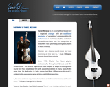
The New DanielMenjivar.com
by Daniel Menjívar • #technology
Back in , I wanted to add some functionality to the events page of my music website. At this point, I can’t remember what that intended extra functionality was (something related to timezones maybe?) – but what I do remember is that it was a real pain trying to weed through all the code. It was a mess.
So I decided to re-write the events portion of my website, which then lead to my decision to re-write the whole thing, which lead to re-designing the whole thing too, which lead to… You get the idea.
Almost eight months later, the new site is finally up. I’ve been working on it here and there in my spare time – which hasn’t been too plentiful with the latest deluge of requests for charts that I’ve had.

The new design is very simple and perhaps more functional than it is aesthetically pleasing. Indeed, while it’s an obvious huge improvement over the previous design, and even though there’s a separate iPhone version and a very nice print stylesheet so pages print nicely too, it’s nothing to brag about. it’s not about to win any design awards! But it should definitely make everything a lot easier to access.
The real major improvements are under the hood. it’s a complete re-write and even the database structure has changed significantly – in fact, that’s what changed the most! More than just a website, it’s a web app that facilitates and automates a lot of my life as a musician. Under the hood, it does much more than meets the eye to the average visitor – now I can focus more on music, and spend much less time doing techie things. I love automation!
There’s a lot of cool technical things I’ve done that I want to blog about, but I’m not going to make this article a technical one, so I’ll save those for future articles. (Check back for those!)
On the end-user side of things though, Here’s a couple improvements worth mentioning, some of which might not be so obvious at first glance:
- A couple links were moved off of the main navigation to make the site less cluttered and easier to find what you’re looking for.
- There is now a sub navigation, which allows me to organize pages a lot better. A notable example of this is the charts section of the site – everything used to be on one page and things were a lot harder to access since it required a lot of scrolling.
- I opted not to go with a two column design (no "side" content) in order to keep things less cluttered. I hate going to websites with so much stuff on a page that you don’t know what to read first.
- On the events section, events are now grouped into years instead of a huge long list. The main events page now loads much faster. You can still subscribe to the RSS feed, and subscribe to an iCal feed of events, as well as add individual events to your calendar.
- You can now get all my events for just a particular country, province, city, venue, year, month or artist. It will show you all upcoming events as well as past events for the given filter. (Try "/events/canada/alberta/calgary/don-quijote" for example, or "/events/artist/masacote"
- In addition to filtering events, you can also search for event keywords. This is super cool – try searching for a genre, maybe "merengue" or "salsa". Or how about searching for "Israel Berriel" to see all the gigs I’ve played with Toto, for example? Or how about combining the two? "Israel Berriel Jazz" Or want to see all flamenco events on a Friday in Calgary? "Flamenco Friday Calgary" The options are endless. Very cool!
- The charts section, (which is the most frequently accessed part of my website – and the most revenue-generating section too), has been separated into smaller, more specific pages. There is also a page where you can download FREE charts, and some of them are even full-band arrangements. Crazy!
- One of the questions I get asked a lot is about a list of charts, so that list has been expanded and you can sort the list by the title, artist, genre or type of chart. For all other questions, there’s an easy-to-access frequently asked questions page.
- All media on the site (audio, video and the arrangement samples) now use HTML5, so you shouldn’t need a plugin. If you haven’t updated to a modern browser and are still using outdated technology though, <cough>Internet Explorer</cough>, it falls back to QuickTime, which comes bundled with iTunes, and everyone owns an iPod now a days, no? ;-)
- it’s now easier to share content on my website using the "Add This" button on the lower right corner of every page. Email it to a friend, add it to Twitter, tons of options…
The contact page has a lot more contact methods now (but don’t ask me why Facebook is there if I hate checking it), and there is a lot of new, cool stuff that happens under the hood when someone sends me a message, but I’ll save that for a later article.
Anyways, before I start getting too technical, check out the site, and then check it out on your iPhone too – let me know what you think.