HTML5 Threaded Comments
by Daniel Menjívar • #blogging #codeAt the beginning of this year, I updated my blog with a new design and HTML5 theme. There were a lot of changes I wanted to make to my custom WordPress plugin and theme: apart from using semantic HTML5 markup, I wanted my audio and videos to play back without requiring a plugin.
There are several HTML WordPress themes out there but I wanted to create my own from scratch. The one thing I wasn’t able to find anywhere was a proper implementation of HTML5 comments, especially when it comes to threaded comments. All the more reason to create my own theme from scratch!
Before creating my theme, I read through “Designing a blog with HTML5” on HTMLDoctor.com and had a good look at lots of HTML5 articles. My first HTML5 project was my music site DanielMenjivar.com so I already had experience with HTML5, just not in the context of a blog.
Here’s the basic structure of the markup for each blog post:
<article>
	<header>
		thumbnail image
		<h4>article title</h4>
		<time pubdate datetime="YYYY-MM-DDTHH:MM:SS-05:00">Published Date/Time</time>
	</header>

	<!-- blog article content… -->

	<footer>
		links to categories, tags, how many comments, etc.
		Last Modified: <time datetime="YYYY-MM-DDTHH:MM:SS-05:00">Modified Date/Time</time>
	</footer>
	<section id="comments">
		<h4>99 responses to blog title…</h4>
		<article>
			<header>
				gravatar image
				Comment by author name
				<a href="permalink to comment"><time pubdate datetime="YYYY-MM--DDTHH:MM:SS-05:00">Comment Time</time></a>
			</header>

			<!-- comment text -->

			<footer>
				<a href="reply link for threaded comments">reply button</a>
			</footer>
		</article>
	</section>
</article>
<div id="respond">
	<!-- comment form -->
</div>
You’ll notice that the comment form sits outside of the blog article, but more importantly, all the comments are wrapped in <article> tags and are nested within the main blog article. The spec says:
When article elements are nested, the inner article elements represent articles that are in principle related to the contents of the outer article. For instance, a Web log entry on a site that accepts user-submitted comments could represent the comments as article elements nested within the article element for the Web log entry.
So now when we’re talking about threaded comments, those need to be nested articles too, like this:
<article id="alex">
	Alex’s comment.
</article>

<article id="bob">
	Bob’s comment.
	<article id="cindy">
		Cindy’s comment in reply to Bob.
	</article>
</article>

<article id="daniel">
	Daniel’s comment.
	<article id="evelyn">
		Evelyn’s comment in reply to Daniel.
		<article id="fred">
			Fred’s comment in reply to Evelyn’s reply to Daniel.
		</article>
	</article>
</article>
Make sense?
The next step was figuring out how to visually represent this to users: the design part. I frequently come across blogs where the comments are formatted/designed in such a way that you really have to struggle to figure out how to reply to another comment and not just create a new parent comment. Other times, I see comments organized in such a way that it isn’t clear which comments are replying to other comments, and which comments are replying to the main article… Confusing!
So I wanted to design the threaded comments on my blog in such a way that you could tell just by looking at it, and also that it would encourage people to reply to the appropriate comment and not create new parent comments all the time, if that’s not what was intended.
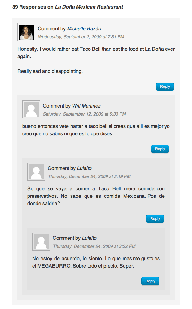
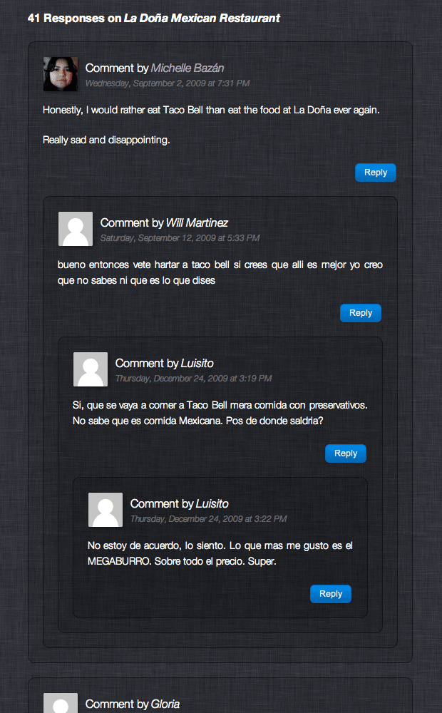
Here are some screenshots of the comments on my review of La Doña Mexican Restaurant where you can see my implementation of threaded comments in action:


I used opacity (an alpha channel) on the background colour of the comments:
#comments article {
	background: rgba(192,192,192,0.2);
}

#comments article.byuser {
	background: rgba(161,215,229,0.2);
}
When a comment is replied to (creating a nested/threaded comment), the background opacity of the child comment stacked on top of the parent comment makes it increasingly more opaque… But since IE doesn’t support rgba, I’m just adding a left border to each comment instead, which creates a look similar to how email replies are commonly formatted:
#comments article {
	border-left: 1px solid #82aeba;
}
Only IE gets the left border from above. All other browsers use the background opacity.
I think this makes it much easier for readers to see and understand threaded comments. What do you think?